You can often recognise an illustrator's work from across a room, and it is rarely the logo that does it. More often it is a particular weight of line, a fondness for faded ochre, or a way of writing emails that feels friendly without being fussy. Branding is the sum of those choices, made deliberately rather than by accident.
The useful part is that you already own most of the raw material. You simply have not written it down yet. What follows is a working method for turning how you draw and how you talk into something a client recognises before they have even opened your portfolio.
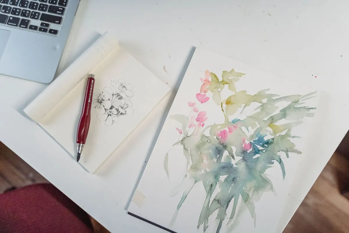
Before you open a design tool, gather the last twelve to fifteen pieces you have finished, including the ones you were not entirely happy with. Lay them out and look for repeats. What subjects keep appearing? Kitchens, night-time streets, overgrown gardens, small dogs. What about line quality — scratchy, confident, geometric, soft? Is there a palette you return to without thinking? What mood do the pieces share: wry, quiet, busy, gentle?
Write three or four sentences describing what you find. Then ask three people, ideally one friend, one fellow creative and one person who is not in the industry at all, to describe your work to someone who has never seen it. Write down the words they use. If "warm" or "wonky" or "detailed" comes up twice, that word belongs in your brand vocabulary. Circle the American spelling trap too — in the UK, it is colour, not color, and illustrator with two l's can look odd to British clients, so be consistent.
Your illustrations should be the loudest thing on any page. The logo's job is to sign the work, not to compete with it. That gives you three sensible options: a wordmark set in type, a monogram of your initials, or a small drawn motif lifted from your own practice — the pigeon that appears in half your pieces, a rubber-stamp shape, a hand-drawn ampersand.
Whatever you choose, test it hard before you commit:
If you use a typeface rather than drawing the letters, check the licence covers commercial use and the kind of products you have in mind. Free fonts are not always free for everything, and it is worth reading the terms properly.
Identity is the set of rules that make your portfolio, PDFs and social posts feel related. Keep the rules few enough that you will actually follow them.
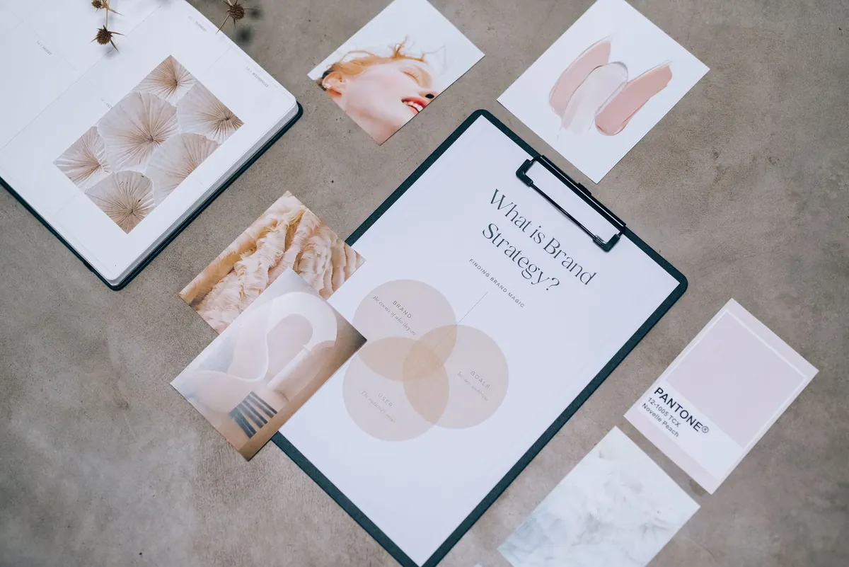
Pull three to five colours straight from your work: two neutrals for backgrounds and text, one or two accents, and perhaps a paper tone if you like a printed feel. Note the hex codes somewhere you can find them, and use the accents sparingly — a coloured rule under a heading is usually enough.
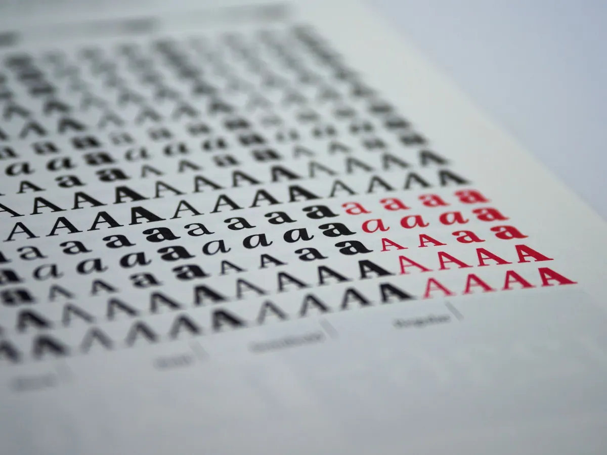
One family in two weights will carry almost everything. If you want more character, pair a clean sans for body copy with something more distinctive for headings. Set a minimum body size you never go below, and resist the urge to centre everything.
Decide your default page: generous margins, a consistent caption style, a credit line in the same place every time. Repetition is what makes a portfolio look considered rather than assembled.
Keep these assets in one folder: logo files, palette, typefaces and their licences, a caption template, an email signature, a one-paragraph bio, and an avatar image that reads clearly inside a small circle.
Voice is simply how you write, and it matters most in the emails that win or lose work. Compare these two openings to a potential client.
Dear Sir/Madam, I am writing to enquire whether you might possibly be interested in commissioning some illustration work.
Hello Priya — I saw the new signage at the Harrow café and thought my line work would suit menu illustrations. Three recent pieces are attached, along with my rates. Happy to send roughs first if that helps.
The second one is not cleverer. It is just warmer, more specific and quicker to answer. A few habits will keep your writing consistent:
If you are naturally dry, be dry. A forced jokey tone reads worse than plain, courteous professionalism.
Consistency does not mean everywhere at once. It means the same name, avatar and two-line bio on every platform you use, and the same palette on your website, your PDF and your invoice template. Choose one social platform and post the thing you genuinely enjoy making — sketchbook pages, colour studies, a work-in-progress. A steady trickle beats a burst of enthusiasm followed by six silent months.
A quick test: show someone your website, your profile and a sample client email side by side. If they cannot tell all three came from the same person, tighten the details until they can.
Brands drift. Look yours over every year or so, or after a real shift in your work — a new medium, a new market, a change in the kind of commissions you want. Adjust rather than rebuild: a new bio line, a warmer accent colour, a cleaner portfolio layout. Keep the old files in case you change your mind.
None of this needs a budget beyond the hours you already spend drawing. Treat it as housekeeping rather than a rebrand: a folder, a palette, a sentence about what you do, and a tone you can keep up when you are tired. Brands are habits, not finished objects. Start with the sentence you would use to describe your work at a party, then make everything else agree with it.
Photo: Greta Hoffman / Pexels