Most portfolio sites look slightly wrong long before anyone can name the problem. The images are strong, the copy is clear, and yet the page feels loose, as though the parts never agreed to sit together. Typography is usually where that unease begins. Two typefaces fighting for the same job will undo good work in a way that no amount of colour correction can fix.
Pairing fonts is not about finding the fashionable combination of the moment. It is about giving each typeface a clear role, choosing contrast you can actually see, and then building a hierarchy that tells a visitor what to read first. Get those three things right and almost any sensible pairing will hold.
Before you open a font library, decide which voice does the reading and which does the announcing. Body text carries paragraphs, captions and project descriptions; it needs to disappear into the act of reading. Headings and navigation do the opposite — they need shape and presence so a scanning eye can find them quickly.
A serif for body and a sans for headings is the safest split, and it is safe for a reason: the structural difference is obvious at a glance, so nobody has to squint to work out why the two look different. The reverse, a sans for body and a serif for headings, works just as well and tends to feel more editorial.
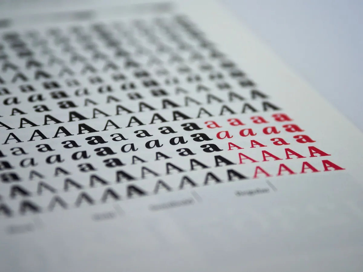
What fails is pairing two typefaces that are almost alike. One humanist sans beside a slightly different humanist sans reads as an accident rather than a decision. Contrast should be visible from across the room: serif against sans, geometric against grotesque, a high-contrast display face against a quiet text face.
Comfortable for portfolios with plenty of writing. Something like Source Serif or Lora for paragraphs, with Inter or Work Sans for headings and navigation. Keeping the headings in a sans means project titles stay crisp at large sizes, where very fine serifs can thin out and look fragile.
Good for image-led portfolios where the text is short. A restrained sans for captions and metadata, plus a characterful serif for your name and section titles — EB Garamond or Playfair Display, for example. Treat the display serif as a heading face only; it will not survive a long paragraph at 16px.
The most underrated option. A large family with genuine range can carry the whole site: headings at 600, body at 400, captions a step smaller with looser spacing. Less to load, less to go wrong. If the family has a matching serif companion, so much the better — the two were drawn to sit together.
Most beginners reach for size alone and end up with headings that shout over body text that whispers. Size matters, but it is only one of four levers worth pulling.
Colour and case are quietly effective too. A heading in a dark grey, or a small label in uppercase letters, can separate levels without adding a single pixel of size. Keep line length to roughly 55–75 characters; wider paragraphs lose the reader at the end of every line.
Accessibility is not a separate task bolted on at the end. It is mostly a set of small decisions about how type renders on real screens.
Two families and three or four weights in total is plenty. Every extra weight is another file, and a portfolio that loads slowly is a worse design decision than a plain one.
Specimen pages flatter every pairing. Your titles will be uneven lengths, your captions will contain awkward numbers, and one day a client will send you a project name that runs to sixty characters. Build a test page with:
If the hierarchy still holds when the content is ugly, the pairing works.
Pick one body face and one heading face, limit yourself to three candidates for each, and compare them on the same page with the same content and colours. Then step away for an hour and look again. The wrong pairing usually shows itself as fussiness around the headings, or as body text you simply do not want to read.
Choose the quieter option more often than the louder one. A portfolio exists to show the work, and good typography is what makes that work easy to look at.
Photo: Brett Jordan / Pexels